Creative Media Center
Paul Rand

Description
Subject Matter:
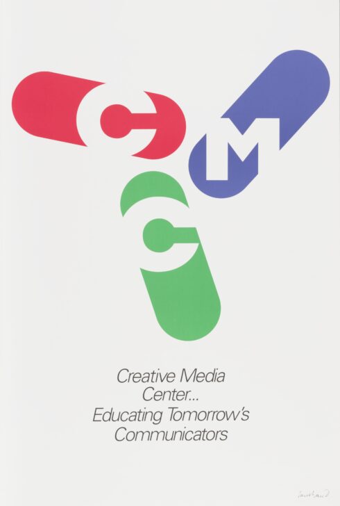
Paul Rand’s logo for Creative Media Center evokes movement. The oblong shapes are approximately in a Y shape that is not dissimilar to the blades of a fan or a windmill. The symbol’s association with these rotating objects means that the logo is read cyclically instead of linearly. Rand cleverly uses negative space for the letters of the logo. The letters seem to have emerged from the white background and are framed by the multi colored shapes.
EC 2017
Physical Description:
A white poster advertising the Creative Media Center. The center features a graphic with the letters C, M, and C arranged in oblong, symmetrical shapes colored red, blue, and green.
Usage Rights:
If you are interested in using an image for a publication, please visit https://umma.umich.edu/request-image/ for more information and to fill out the online Image Rights and Reproductions Request Form.