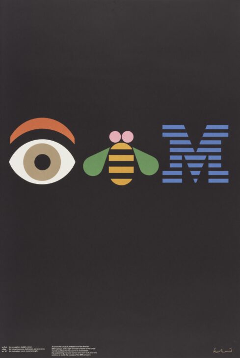
EYE-BEE-M (Rebus)
Paul Rand

Description
Subject Matter:
This poster EYE-BEE-M (Rebus) is part of IBM’s century-long THINK promotional campaign. IBM executives were initially displeased with the design because they felt it projected a negative image of the company. Rand cleverly transforms the letters of IBM’s logo into pictures (known as a rebus): the “I” as a lidded eye and the “B” as a winged bee. The “M” maintains the style of the iconic blue-striped IBM logo, which Rand also designed. The design of EYE-BEE-M compels viewers to think in order to comprehend the company’s message. The tactics are unorthodox, but they critically communicate that IBM is a company that values “insight,” “industriousness,” and “motivation.” These values characterize IBM’s corporate identity. As Rand himself stated, it is the designer’s task to convey a company’s identity to the viewer.
EC 2017
Physical Description:
A black poster featuring an image of an eye, a bee, and an 'M' with lines dividing it. The bottom left offers a textual explanation of the symbols.
Usage Rights:
If you are interested in using an image for a publication, please visit https://umma.umich.edu/request-image/ for more information and to fill out the online Image Rights and Reproductions Request Form.