UCLA Summer Sessions
Paul Rand

Description
Subject Matter:
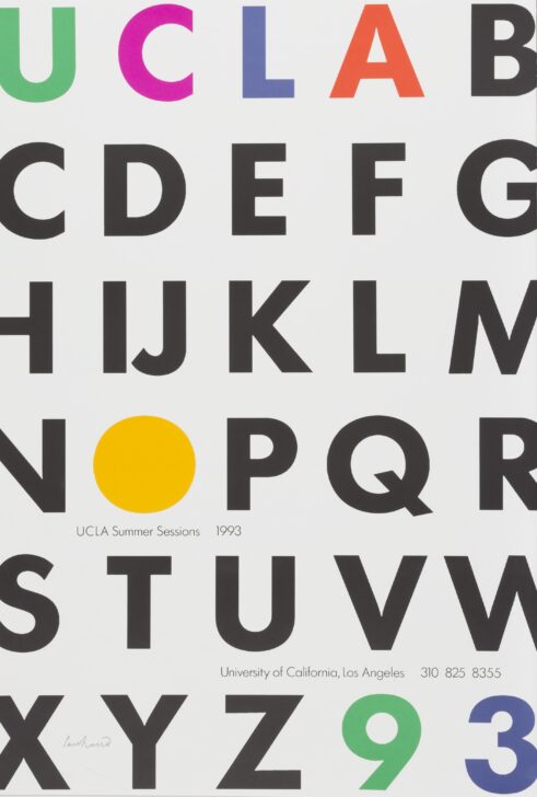
Paul Rand claimed the reason for his fruitful association as a designer for University of California, Los Angeles (UCLA) was because, “I do the job, and they accept it.” Like many of Rand’s other designs for UCLA, the focus of the poster is less on figurative imagery but rather on the aesthetic qualities of the text. The key information for this poster is situated within the alphabet. It is a clever visual trick, but it also links the message to education. The alphabet is symbolic of the early stages of learning, so the viewer connects the summer sessions with a simpler, and perhaps more positive stage of learning. Rand cleverly uses the letter ‘A’ as both the end of UCLA and the beginning of the alphabet. He, also, whimsically rhymes the final letter of the alphabet, ‘Z,’ with the year ‘93’.
EC 2017
Physical Description:
A poster featuring "UCLA" at the top, the letters multi-colored, followed by B-Z of the aplphabet in black text, arranged in rows. The 'O' is filled, colored yellow. In the bottom corner, '93' appears. The poster advertises the UCLA Summer Sessions of 1993.
Usage Rights:
If you are interested in using an image for a publication, please visit https://umma.umich.edu/request-image/ for more information and to fill out the online Image Rights and Reproductions Request Form.